Printables, worksheets, workbooks, planners, guides, PDFs — whatever you want to call them — they’re everywhere. You see them as opt-in freebies for email lists, content upgrades on blog posts, even entire shops full of them (hint, hint…). But you know what you also see a lot of, unfortunately? Bad design. Printables that are overworked and unprofessional, and as a designer, that’s a bummer! I know the creator worked hard on the content, put thought (hopefully) into how the printable could be useful to the customer, but the design lacks function and actually makes it harder for the customer to use the product in the first place. That’s the opposite of what a product should do for a customer. It should help them solve a problem, not create a new one for them.
Your products (whether paid or free) will either engage customers or turn them away. Quality design engages your customer – making it more professional, and helping you establish yourself as expert in your field. If your product doesn’t look professional, it will be hard for your customer to take you (and your business) seriously, and trust that it is even of value to them or worth their time.
If your printables or worksheets that you create are a compliment to your brand (i.e. they’re content upgrades, opt-in freebies, or even paid products), designing them to be cohesive with your overall brand will create brand recognition for your business, build authority in your brand, and increases the perceived value of the printables themselves. If you’re not a designer yourself or don’t trust your skills enough to create quality design work for your products – hire it out! There’s no shame in that. Don’t feel pressured to do it all yourself. Sometimes DIY is not the best option, and hiring a professional to get the job done faster and better than you can do it yourself can be a great investment for your business.
5 tips for designing practical printables
A great way to start on the design of your printable is to see it from the customer’s point of view, and ask yourself this important question: how exactly will my customer use my product? Think about the practical + logistical elements of the printable itself and how your customer will interact with it. Put yourself in their shoes, as you think about these 5 tips:
01. Function
Is the emphasis on the design or the function? Am I keeping it simple and not over-designing? Is it actually functional for them to use?
Just like the old saying goes, “Form follows function.” First and foremost, your printable or worksheet needs to be functional to use, not just attractive to look at. Over-designing your page could mean using too many fonts, too many illustrations or embellishments, too much color, or even too much content. There’s a fine line between a printable that is dumbed down to a level where the content isn’t even useful, and a printable that is overly-designed to compensate for the lack of valuable content. Find the middle ground of being minimally-designed but still attractive and providing high-value content that is easy to follow and practical to use.
Good example: Elle + Company is a great example of a designer who values function in her printables. She has a library full of practically-designed worksheets and printables that aren’t overly-designed, but still provide enough simple design elements to make them fun to use, plus they’re high-value in the actual content they’re displaying.
02. Spacing
If they’re meant to write in responses, is there enough space to do so?
If the purpose of your worksheet or printable is to have your user fill in answers to questions or prompts, wouldn’t it make sense to make sure there’s enough room to do so? Just today, I downloaded a workbook for something, and it didn’t have enough room to write in words on a fill-in-the-blank section and it was so frustrating! Simple things like that can get overlooked as you’re designing, so be sure to put yourself in their shoes and actually put some thought into how much room they’ll need for each question or prompt you’re giving them. Make it functional, not frustrating!
Good example: Erica Midkiff’s content planning worksheets and workbooks are a great example of proper spacing. She gives plenty of room to answer questions, fill in blanks, and write down notes on all of her worksheets.
03. Printing
Are they going to print it out, and if so will it suck their printer ink dry? What if they only have black ink, will it still look good printed grayscale?
The word printable says it all! Many customers or users will print your worksheet out, so consider the printing process, especially on home printers. Think about how much ink it will take, and if that ink is black or full color. This will force you to keep your design minimal, which is usually a good thing! Again, remember the purpose of the printable – to be functional and practical to help them solve a problem. Don’t create another problem for them by making your design too heavy for their home printer to handle.
Good example: The Day Designer printables are some of the most printer-friendly designs I’ve ever had the privilege of designing for. Their established look is sophisticated and minimal, and it makes my designer heart happy. Literally zero color, but the simplicity of them makes them ultra-chic and uber-practical.
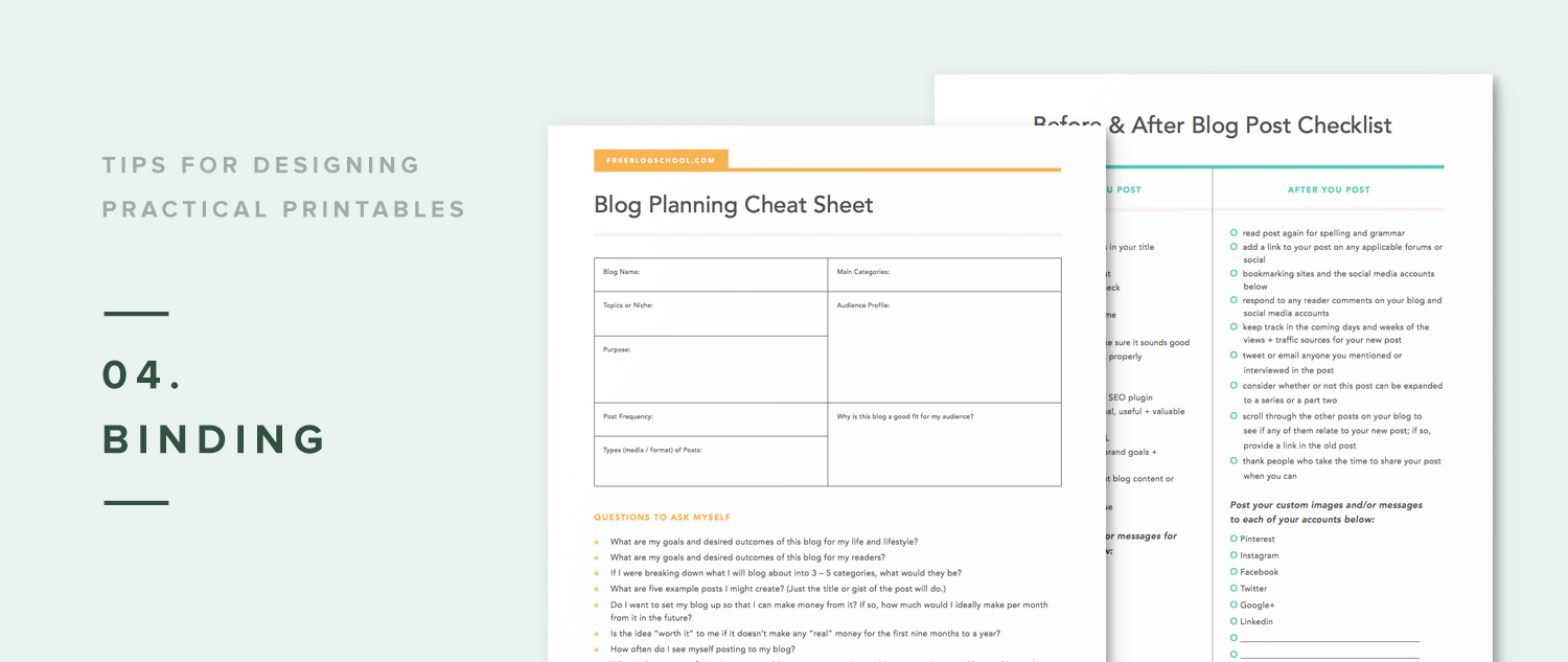
04. Binding
Do they need room to hole-punch it? If they decide to bind it, is there enough margin to do so without cutting off my content or making it difficult for them to write in?
This is a part of page design that is often overlooked. The standard margin to allow for hole-punching is 0.75 inches, so consider this as you’re setting your page’s margins and guides. Even if your customer decides not to hole-punch or bind, this amount of margin is necessary just for balance on the page. Making your content go too close to the edge of your page makes the whole thing feel overwhelming and crowded. The opposite of what you want your customer to feel when using your worksheet, right? If you don’t allow enough margin and your customer decides to bind it or hole-punch it, it could cut off important content on your page and make it even more difficult for them to use your product. Again, the opposite of what you want.
Good example: ByRegina is notorious for her epic worksheets. I’ve had the privilege of redesigning many of them for her recently and one thing we made sure of was creating ample margins to allow for hole-punching or binding if her users wanted to keep all her worksheets in one binder or notebook.
05. Editing
Will it be fillable or editable, and if so, do they need instructions on how to do that? What program will they need to open the file if they want to edit / fill it in?
The term editable in the PDF printable world is a bit of a misnomer. Typically, editable means that blank fields on the document can be filled in on-screen prior to printing, but existing text that is part of your original design cannot be edited. That being said, considering the end-use of your product from the customer’s point of view can mean that they may never want to actually print your printable at all. Many people prefer to fill in their content on their computer and keep the file digital, so consider adding this feature to your printables or worksheets as you’re creating them. (Hint: there's a bonus video included with The InDesign Field Guide on how to create editable PDF's!)
Good example: Had to throw in one of my own, here! Almost all of my printable planners in my shop are editable, which means they can be filled in on-screen prior to printing. I include instructions on how to do this in every product description of all my product, plus in confirmation emails after they purchase so they know exactly how to add in their own content.
Other important considerations to remember:
File name – Your customer is going to download this file to their computer, so that file name needs to be clear and concise. If they see it sitting on their desktop 3 months after they downloaded it, you want them to remember where and who it came from.
Copyright – To protect your work, be sure to add a line somewhere on your page that says © 2016 Your Business Name, www.website.com. This at least deters someone from stealing your content, though unfortunately it doesn’t completely prevent it.
Instructions – If your printable or worksheet requires some kind of extra explanation, instructions, or specific terms of use with it, consider adding a separate page in the PDF that outlines these things.
Bonus tip!
Strive to be unique and original in your design – do not copy something you’ve already seen. If you’re unsure about how to do that, read more about my take here. Finding your own unique way in this world of online business is extremely important. Don’t reinvent the wheel, and don’t steal ideas from other’s who have worked hard to set themselves apart. Carve your own way, and your customers will appreciate you even more for that. (And you’ll be happier with yourself, too, knowing you did it the right way.)
Want my design cheatsheet for file prep standards?
Drop in your email, and I'll send you my cheatsheet for prepping your final files for print. This is a great reference to have on hand, and it's pulled straight from my course, The InDesign Field Guide, which teaches you how to use Adobe InDesign like a pro for things like printables, workbooks, ebooks, etc.
Watch me design a PDF printable day planner + promo graphic, start to finish.
Reading a blog post about design is one thing, but it’s a whole other learning experience to WATCH me design on-screen — so this is your permission to hover, my Internet friend.
Signup to watch my free on-demand workshop: How to Design a Printable Planner + Promo Graphic in Just 20 Minutes!
Get a behind-the-scenes look at my design process using Adobe InDesign, and learn some new tricks to help you work smarter + faster in your own business with the help of this powerful (and not so scary) program.
Your Turn
What are some of your favorite printables or worksheet designs that you’ve seen around the interwebs? What parts of the design stood out to you? How can you apply these tips to your own designs?


